
Think in Color: Why Your Visual Choices Matter More Than You Think

Color isn’t just decoration, it’s communication. The shades you choose in your branding, your home, and even your wardrobe speak directly to the brain. Every shade you see and surround yourself with is sending signals straight to your brain. It influences your mood, your focus, your appetite, even how much you trust someone. Whether you’re an entrepreneur, marketer, or someone wanting to create a more peaceful home, understanding the psychology of color gives you a powerful edge.
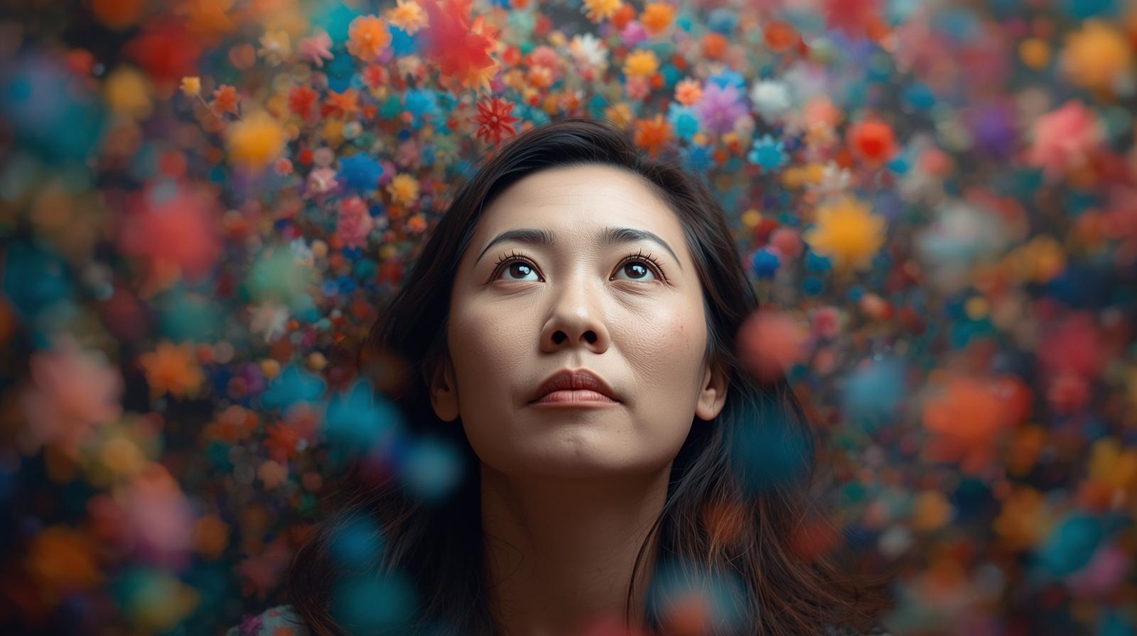
.png) Color
and
the
Brain:
What
the
Science
Says
Color
and
the
Brain:
What
the
Science
Says
Color actually changes your brain chemistry. Research shows that red can raise your heart rate and appetite, while blue can calm you down and even lower your heart rate. In one fascinating study, Tokyo train stations installed blue lights at the end of platforms—and suicides dropped by 74%. Just by changing the color of the lighting, they changed behavior. In prisons, blue or pink walls have been shown to reduce aggression. In classrooms and offices, certain shades can boost concentration or spark creativity. Our brains respond instantly and instinctively to color.
Why Color Feels Personal
Not everyone reacts to color the same way, though. Culture, upbringing, and life experiences shape how your brain processes color. Maybe your childhood kitchen was painted green, and now you can’t stand that shade. Or maybe someone who hurt you always wore blue so blue feels uncomfortable now, even though it’s technically a “calming” color.
Color has layers of meaning. Some are universal; some are deeply personal.
.jpg) How
Color
Shapes
Your
Brand
How
Color
Shapes
Your
Brand
When it comes to business, color is one of the most powerful and most overlooked tools in your branding toolbox. Think about it: when someone lands on your website or sees your logo, what do you want them to feel? Safe? Energized? Inspired? The colors you choose create that first impression long before your words do. If your color palette doesn’t match your brand message, people will feel the mismatch, even if they can’t explain it. So it’s worth getting intentional.
Here’s a quick guide to what some common colors say to the brain:
🔴 Red: The Attention-Getter Red means action, energy, and appetite. It grabs attention fast, which is why “Buy Now” buttons are often red. But too much red can feel aggressive or overwhelming. Use it as an accent, not a wall-to-wall statement. Want to lose weight? Don’t paint your kitchen red, it can actually make you hungrier!
🔵 Blue: Calm and Trustworthy Blue is all about trust, calm, and confidence. It’s perfect for brands and professions where stability matters like finance, coaching, or healthcare. In your home, blue creates peaceful spaces think bedrooms, living rooms, or even kitchens (it can curb appetite too).
🟢 Green: Growth and Balance Green is the color of harmony, nature, and prosperity. It’s refreshing, grounding, and deeply connected to safety. If you’re a financial advisor, add a little green it subtly communicates “money” and “growth.” In your home, green brings calm energy to any space, especially if you can’t always be out in nature.
🟡 Yellow: Optimism and Energy Yellow is your burst of sunshine. It sparks joy, creativity, and optimism but in large amounts, it can be overstimulating. It’s wonderful for creative spaces, kids’ rooms, or businesses centered on innovation and happiness. Use it to lift spirits and energize ideas.
🟠 Orange: Joy and Creativity Orange blends the energy of red with the cheer of yellow. It’s warm, social, and exciting. Great for brands that want to feel fun and approachable like coaches, artists, or entertainers. Even if orange isn’t your favorite color, a few touches can make a space feel inviting and alive.
🟣 Purple: Imagination and Insight Purple is powerful, it’s tied to royalty, creativity, and mystery. It’s my personal favorite because it represents the brain for me: luxurious, complex, and full of magic. That’s why I use purple in my branding—it speaks to creativity, innovation, and the brilliance of the mind.
⚫ Black & ⚪ White: Balance and Contrast Black brings sophistication and authority but can feel heavy if you use too much. White brings clarity, cleanliness, and calm but too much can feel cold or sterile. Together, they create balance. Think of them as your neutrals use them to frame your color story, not to carry it.
🟤 Brown: Comfort and Connection Brown feels earthy and dependable. It’s the color of nature, stability, and warmth. It works beautifully in home design and in businesses connected to the outdoors, animals, or care.
 Using
Color
to
Shape
Your
Space
Using
Color
to
Shape
Your
Space
Color doesn’t just affect how others see you it changes how you feel day to day.
- Want to relax? Surround yourself with blues and greens.
- Need motivation? Add splashes of yellow or orange.
- Feeling stressed? Avoid heavy reds or harsh whites.
- Trying to spark connection? Use warmer tones like peach, gold, or soft purple.
You can change how your home feels and even how you feel in it just by adjusting the palette.
Color and Memory
Here’s a fun fact: color helps you remember things. Studies show that color strengthens memory recall second only to smell. So next time you’re studying for a test, or preparing for a presentation, try linking facts to colors. It’s a little brain trick that works.
 Bringing
It
All
Together
Bringing
It
All
Together
Color is more than decoration it’s psychology in action. It influences your behavior, shapes your emotions, and even impacts how successful your business or relationships can be. So, look around your world. What colors dominate your brand? Your wardrobe? Your living room? Do they reflect the energy, emotion, and intention you want to project? If not, maybe it’s time for a little color refresh because when you understand the brain-color connection, you realize that the right palette doesn’t just make things look better… it helps life feel better too.
-Julie "Brain Lady" Anderson